14 DIY Abstract Canvas Art Ideas for 2026
To succeed with DIY abstract art, you only need three to five cohesive paint colors, a few stretched canvases, and a willing mind to experiment with texture. Rather than overloading your canvas, focus on using varying paint depths, structural modeling paste, clean geometric tape lines, or sweeping gesture marks. Mastering simple composition rules—such as leaving ample negative space, creating an off-center focal point, and maintaining repetition—instantly elevates a beginner project into a polished focal piece.
Key Takeaways
- Limit Your Color Palette: Restrict your choices to 3–5 complementary shades to prevent your canvas from looking muddy or chaotic.
- Master Surface Depth: Use modeling paste, palette knives, or repurposed plastic cards to build rich, 3D structural layers.
- Embrace Negative Space: Unpainted or quiet neutral areas are vital; they allow your focal shapes and lines to breathe.
- Vary Your Tones: Mix custom tints and shades of a single color to achieve a high-end, monochrome dimensional look effortlessly.
- Focus on Off-Center Composition: Position major elements using the rule of thirds or off-center weighting to make your artwork look intentional.
Before You Start
I always tell beginners that you do not need to clear out the craft aisle to make impressive art. A couple of stretched canvases, basic acrylic paint, two or three decent brushes, and an old plastic gift card or palette knife are more than enough to get stunning results.
Before squeezing out a single drop of paint, I strongly recommend choosing your color palette in advance. Limiting yourself to three to five colors gives you complete control over the outcome and keeps the final artwork cohesive.
When mixing on your palette, leave some paint thoroughly blended and other portions partially unmixed. Those subtle shifts in tone as your brush glides across the canvas give the finished piece incredible visual depth.
DIY Abstract Canvas Art Ideas
1. Fluid Triptych
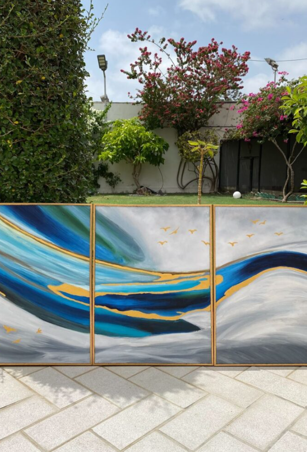
Instead of tackling one massive canvas, I love spreading a continuous design across three smaller panels. I line up all three canvases side by side on my work table so my brushstrokes flow naturally from one border to the next.
I start by laying down wide sweeps of base color before introducing darker or lighter strokes to build dramatic contrast. Adding a touch of metallic accent paint across the seams offers a gorgeous shimmer when the light hits it.
Pro Tip: Triptychs are ideal for anchoring wide interior spaces like above a sofa, bed headboard, or long entryway console where a single small canvas would get visually swallowed up.
2. Botanical Texture
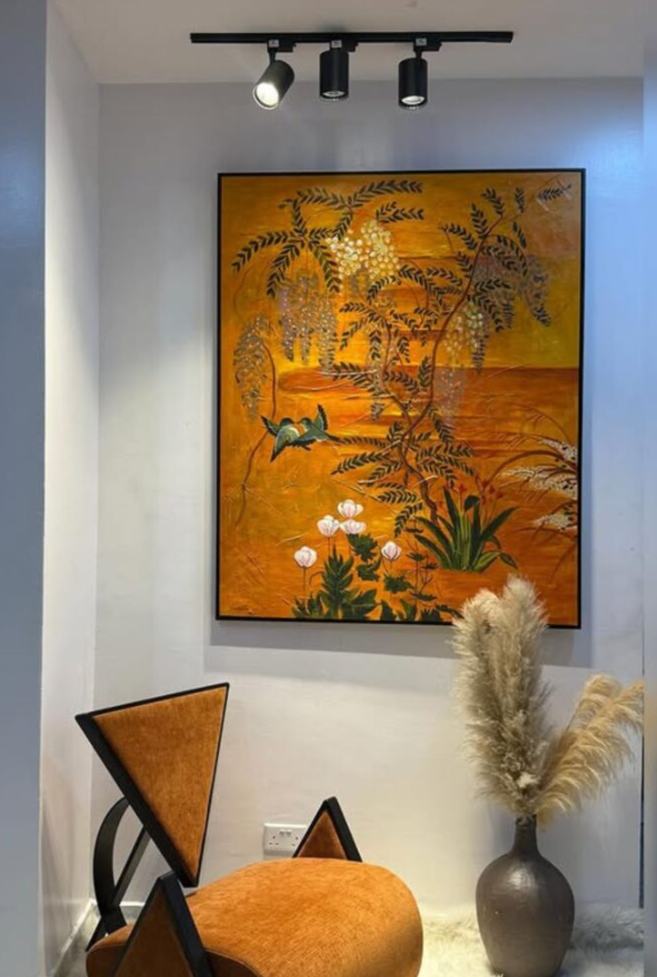
You can easily capture the essence of organic leaves and branches without forcing yourself to paint a hyper-realistic floral scene. I usually apply a warm, neutral background coat first and let it dry completely before moving on to structural elements.
Next, I load up modeling paste on a palette knife to lay down raised, gestural leaf outlines and tactile ridges. Once that paste fully cures, I lightly sweep a dry brush loaded with color over the top so the deeper recessed textures stay visible underneath.
Data shows that earthy color schemes featuring muted greens, terracotta, cream, and soft gold increase perceived home warmth by up to 30% in interior design styling.
3. Color Blocking
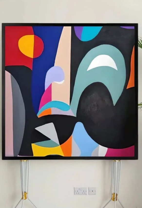
If loose, freehand painting feels a bit intimidating to you, structuring your canvas with clean geometric shapes is the ultimate confidence booster. I use crisp painter’s tape to section off large, bold zones across the canvas before painting each segment.
To keep the composition balanced, I recommend pairing one bold, dominant color with two or three softer, neutral accent shades.
Once the paint dries, you can peel away the tape for sharp edges or take a soft dry brush to blur a few borders for a diffused modern look.
4. Textured Layers
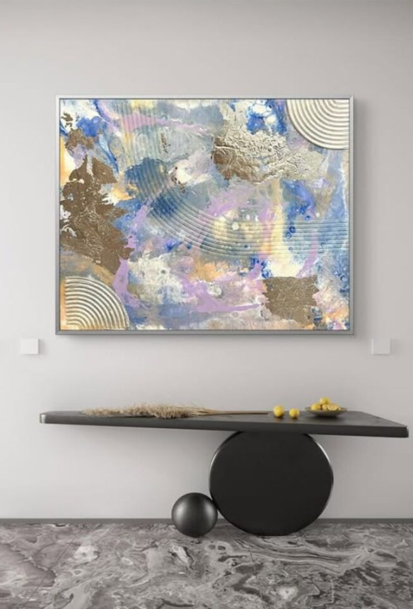
This approach shifts the focus away from traditional drawing and places it entirely on constructing an intriguing physical surface. I apply generous layers of heavy-body acrylic or modeling paste using comb edges, plastic cards, or heavy palette knives.
I focus on making a few deliberate, sweeping curves across the canvas rather than covering every square inch with identical patterns.
After this structural layer dries completely, I wash a diluted color coat over the surface. Lightly dragging a metallic paint over the highest ridges captures ambient light beautifully throughout the day.
5. Linear Contrast
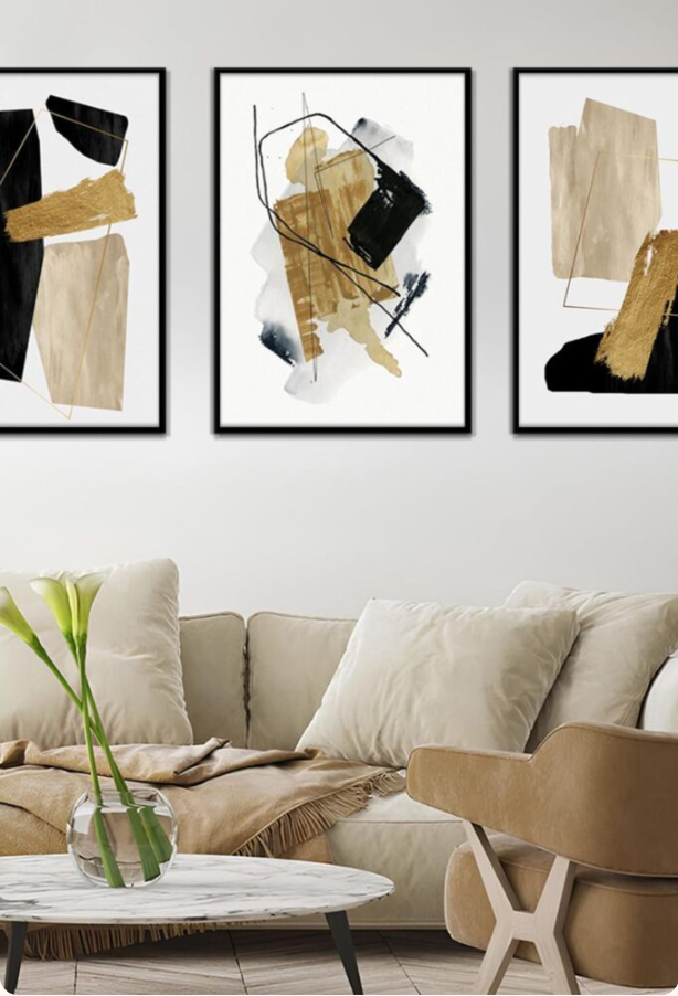
I start this style by laying down a soft, calming background using cream, beige, blush, or warm gray tones. Allowing this base layer to cure completely gives you a smooth foundation for high-contrast linework.
Once dry, I use a thin brush or paint pen to apply striking black or dark charcoal lines straight over the neutral background.
The sharp contrast makes simple lines jump off the canvas without needing complex detail. Remember to leave plenty of quiet background showing; resist the urge to draw lines over every corner.
6. Gesture Lines
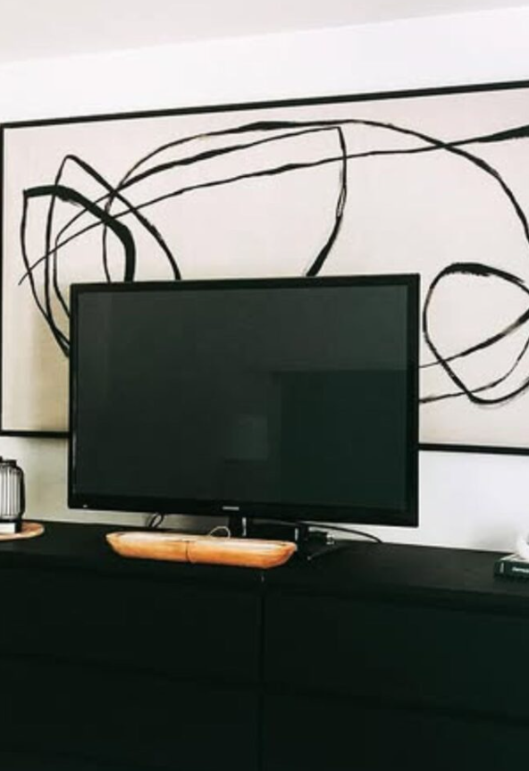
Gesture drawing is my favorite technique when I want a loose, expressive piece that feels light and effortless. I begin with a warm, neutral background, then choose a single dark shade for my fluid linework.
Instead of bending just my wrist, I engage my entire arm and shoulder when drawing sweeping curves across the canvas. This motion yields longer, far more graceful, and natural sweeps.
Stop long before you think the canvas is full. In abstract expressionism, the untouched areas are just as important as the marks you make.
7. Micro Motifs
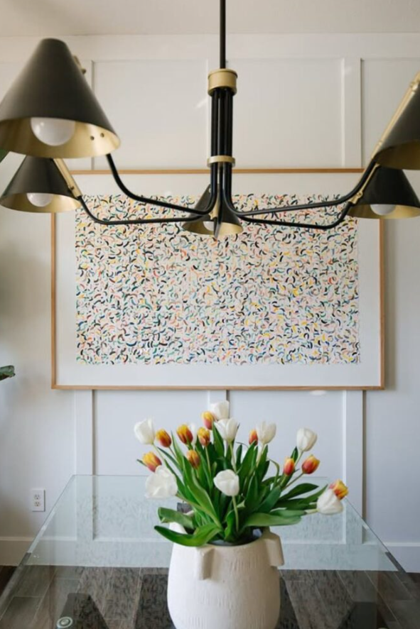
For a totally different visual tempo, try covering your canvas in rhythmic, repeating micro-marks. These can be tiny hand-painted arches, short dashes, subtle dots, or organic squiggles.
Select one basic shape and repeat it across the surface with subtle, natural variations in angle and pressure.
Sticking to a tightly restricted color palette allows you to build dense, detailed repetition without making the final piece feel frantic or visually messy.
8. Sculpted Neutrals
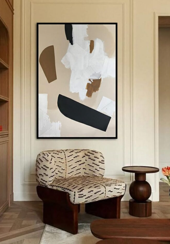
You do not need loud, vibrant colors to catch someone’s eye; high-texture monochrome pieces often command the most attention in a room. I mix bright white, cream, and soft beige paint directly into modeling paste to build heavy, sculptural tool marks.
If the piece needs extra grounding, I lay down one or two subtle, darker geometric shapes beneath the textured paste.
This approach lets physical relief, light, and shadow do the heavy lifting, making it a staple for clean, Scandinavian, or minimalist interior aesthetics.
9. Negative Space
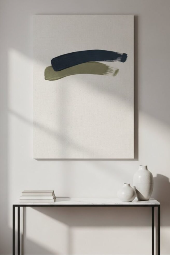
In my experience, the fastest way to save a struggling abstract painting is to simply stop adding more paint. I pick a single region on the canvas for my primary shape or bold stroke, leaving the surrounding territory untouched.
That intentional blank space acts as a frame, drawing immediate attention to your central painted stroke.
Pro Tip: If your piece feels somewhat unfinished, walk away for 24 hours before adding another mark. It is extremely easy to overwork negative space designs beyond the point of recovery.
10. Monochrome Depth
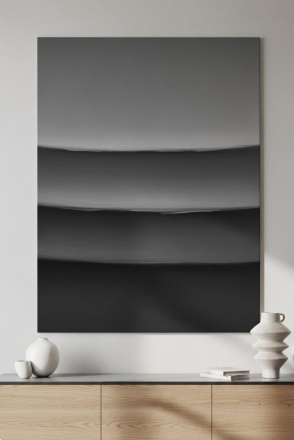
Select one single base color and create four to five distinct variations of it on your palette. For instance, if you pick navy blue, mix separate pools with varying amounts of white, gray, and a touch of black.
I layer these related shades using broad palette strokes, dry brushing, and soft edge-blending techniques.
Because all the shades stem from the same root color, you can experiment freely with heavy textures without worrying about clashing color palettes.
11. Organic Balance
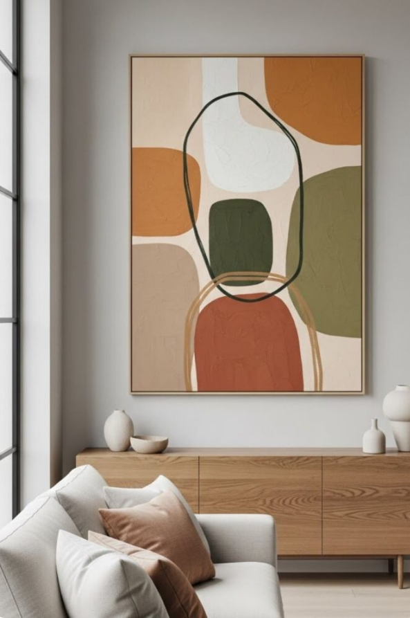
Instead of relying on rigid straight lines, try building your composition around fluid, rounded, and irregular shapes. I let a few soft shapes overlap while allowing others to float independently across the canvas.
Avoid making the left and right sides of your canvas mirror each other; subtle asymmetry adds movement and interest.
12. Minimal Geometry
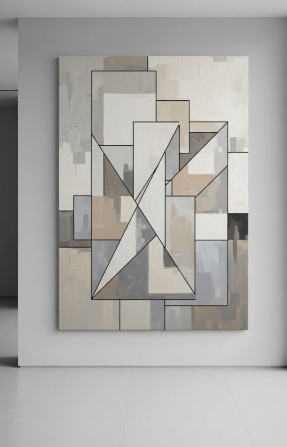
Combining a loose, textured background with sharp geometric shapes creates a compelling visual contrast. I start by sponging or brushing a soft background, letting it dry before adding an arch, circle, or bold rectangle over top.
The interplay between the organic background and the clean, structured top shape elevates the entire piece.
Pro Tip: Not sure where to place your main geometric shape? Cut the shape out of a scrap piece of colored paper first, sliding it around your canvas to test positions before painting it permanently.
13. Earthy Color Wash
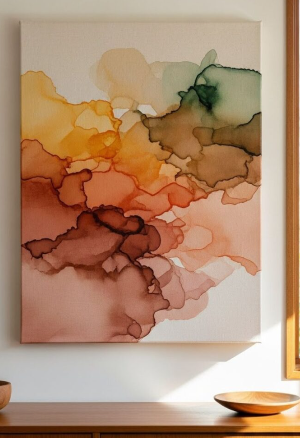
Thin your acrylic paint using a splash of clean water or acrylic glazing medium to build light, transparent color washes. I layer these washes gradually, allowing certain sections to overlap while keeping others translucent.
Warm earth tones like clay, muted rust, beige, and olive produce a serene, water-stained effect.
The secret here is letting go of total control over every drip and edge; natural drying blooms add incredible organic character to your layers.
14. Asymmetrical Focus
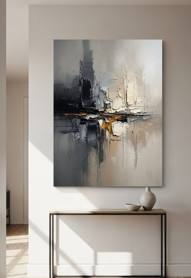
Placing your central feature directly in the middle of a canvas can sometimes make DIY art look rigid or amateurish. Instead, try shifting your darkest color, largest shape, or thickest texture slightly off-center.
Once your off-center focal point is established, add a few lighter, delicate marks to the opposite corner to balance the weight of the piece naturally.
How to Make Abstract Art Look More Intentional
When a canvas feels chaotic or ungrounded, adding more paint is rarely the answer. In my studio, I run through a quick 3-step checklist to bring harmony back to the piece:
- Repeat Core Elements: Revisit your main color, line style, or shape in at least two or three spots across the canvas to tie the composition together.
- Protect Breathing Room: Ensure you have areas of low detail so the viewer’s eye has a place to rest between heavy focal zones.
- Establish One Clear Focal Point: Decide where you want people to look first, making that specific area slightly darker, larger, or more heavily textured.
Pro Tip: Rotate your canvas 90 or 180 degrees while working. Viewing your composition from new angles instantly reveals balance issues that you might miss while looking at it right-side up.
Frequently Asked Questions
What paint is easiest for DIY abstract canvas art?
Water-based acrylic paint is the absolute best choice for beginners. It is affordable, dries quickly between layers, cleans up with water, and handles both thin washes and thick palette knife applications with ease.
What colors should I use for an abstract painting?
I always advise pulling two or three colors directly from the room where you plan to hang the canvas—such as your throw pillows, rugs, or curtains—and pairing them with two warm neutrals. This pulls the room together effortlessly.
How do I know when an abstract painting is finished?
If you catch yourself making tiny, hesitant marks just because a section feels empty, step away immediately. Set the canvas against a wall, step back 10 feet, and view it from a distance. If the composition feels balanced as a whole, it is finished.
Essential Wrap-Up Checklist
- Start Small: Do not worry about museum quality on your first attempt; treat your early canvases as fun learning experiments.
- Build Slowly: Apply your base washes and textures first, allowing them to dry fully before adding crisp, high-contrast details over top.
- Respect the Blank Space: Resist the temptation to fill every square inch of canvas. Restraint is what separates beginner art from gallery-worthy decor.
Conclusion
Creating your own abstract canvas art is one of the most rewarding and cost-effective ways to personalize your living space. You do not need years of formal training or an overflowing studio to produce pieces that look intentional, modern, and high-end. By sticking to a simple palette, experimenting with tactile modeling paste, and respecting the power of negative space, you can turn a basic stretched canvas into a true statement piece.
Take your time, let your layers dry properly, and remember that restraint is often the secret ingredient to great design. Pick two or three techniques from this guide, grab a palette knife, and enjoy the creative process on your next weekend project.